Leason Ellis LLP
attorneys
LEASON ELLIS LLP Templates and Assets
Leason Ellis, the leading IP law firm in Westchester County, New York, came to us with two beloved visual identifiers: a tree with a hole on the right side from which an apple has dropped to the ground, and a “monster” illustration by Stefan G. Bucher. The first order of business was to replace and strengthen the dated typography with a bold, contemporary typographic logotype. We also softened the green and remodeled the apple, giving it a more recognizable shape.
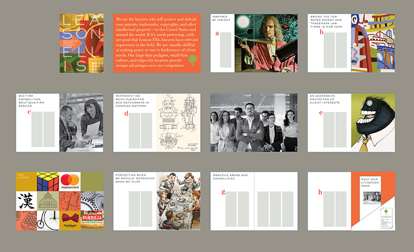
The partners defined the firm as dynamic, forward looking, experienced, focused, savvy, market-oriented, thoughtful, practical, fun, and approachable leaders. The next challenge was to present a vision of the firm that expressed those image characteristics while making the tree — a reference to the inventive genius of Sir Isaac Newton — more relevant and understandable by potential clients. We also recommended commissioning original artwork, as befits an intellectual property firm that celebrates and protects authors, artists, brands, inventors and inventions. This capabilities brochure storyboard — using stock photos and tearsheets as examples — envisions commissioning top illustrators to depict, for example, Newton’s moment of discovery; the office in the transportation nexus of White Plains, NY, 30 minutes from Grand Central Terminal; and the monster as a symbol of aggressive protection of client interests.
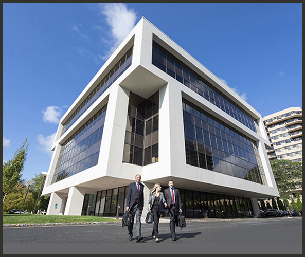
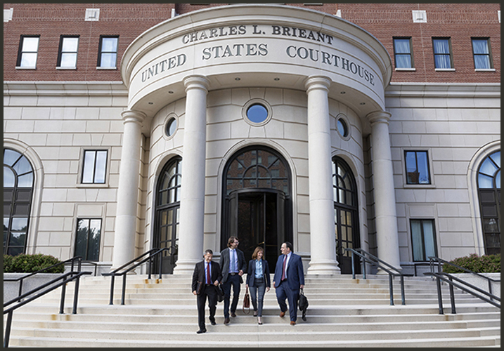
The only available images were headshots of the lawyers and a rendering of the building. We commissioned photographer Dan Bigelow to take working and environmental shots of the lawyers outside their building, in the offices and conference rooms, and at the courthouse
The rule is: shoot it from every angle, then shoot it again.
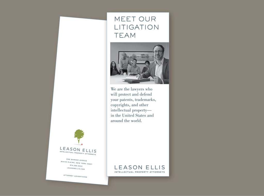
The project began with a request to design the Litigation Team brochure. On the cover, partner Peter Sloane is in the foreground. A color scheme and typographic style sheets were established in Adobe CC Libraries, keeping our custom colors of Leason Ellis Green, Red, and Gray consistent from application to application, print to web.
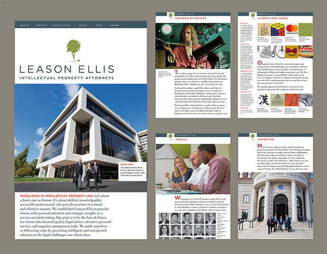
The library of assets can now be utilized in a number of different ways, including a redesigned website.
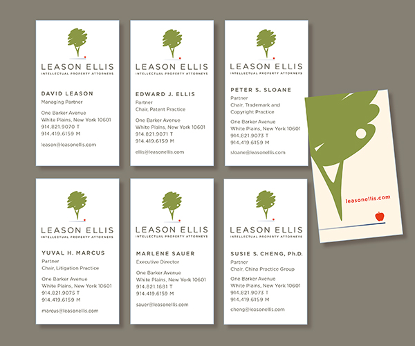
The tree, large and cropped, makes an eye-catching illustration when none other exists. Business cards might seem easy, but aren’t when titles can be one, two, or three lines. Everyone gets a card front with custom-kerned (hand-spaced) type and the same back. We applaud the client’s decision to go with a vertical card.