Brand identity for Cerecor, Inc., Baltimore-based company founded at Johns Hopkins University dedicated to developing neuroscience drugs that improve brain function and mood.
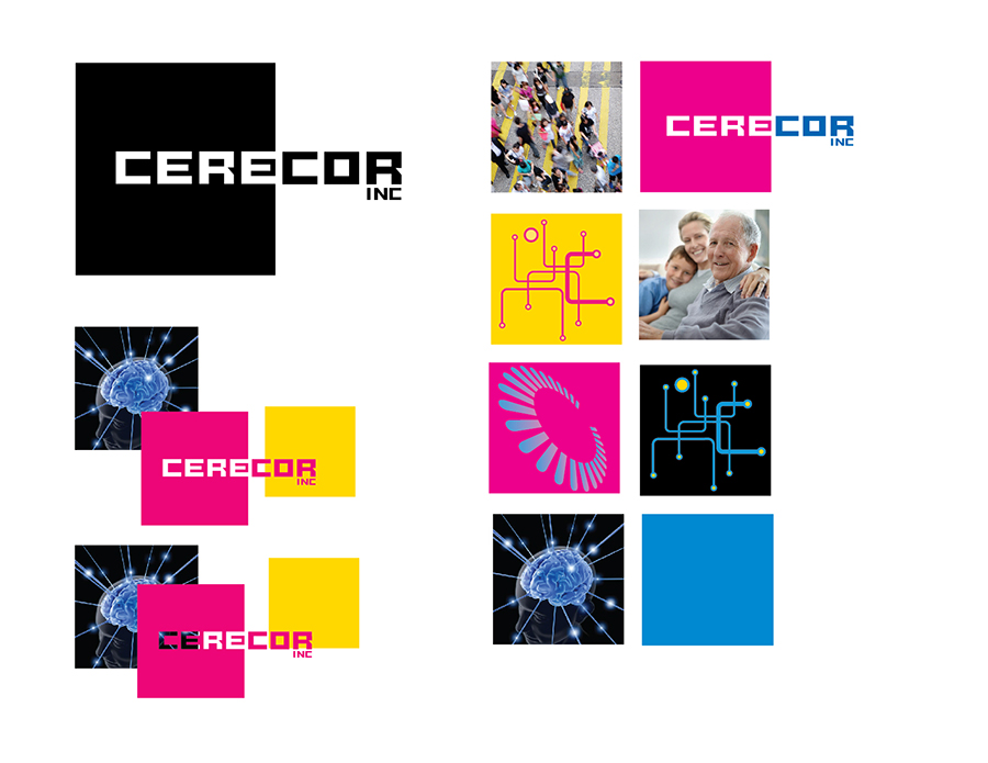
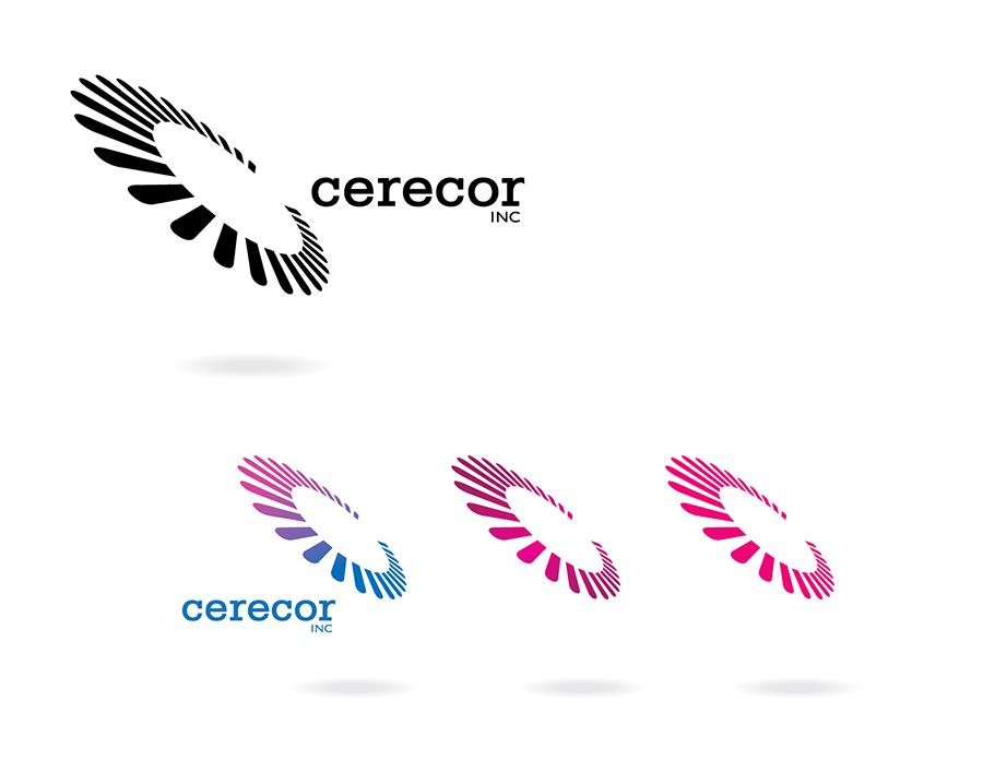
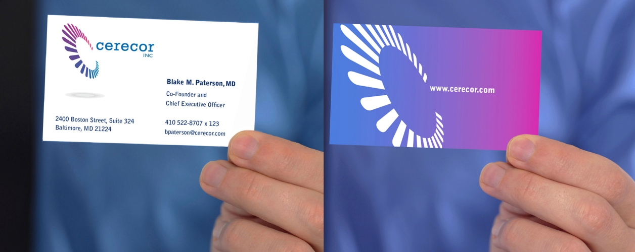
We begin each engagement by carefully defining the “design brief” — the criteria, deliverables, and desired results — with the client. Their only request was that the symbol in some way resembled or derived from the letter ‘C.’ We typically present three options, beginning with a concept that might be an unexpected reach for the client. For Cerecor, we began with a group of squares that contain images, both photographic and symbolic that could be set in motion behind the ‘CERE’ letterforms that created the center of the ‘C’ in the square.The client focused on the spinning, abstract letter ‘C’ that had the potential of changing angle and color, specifically the version that gradually transformed itself from “feeling blue” to “in the pink.” Two-sided color digital printing makes it easy for business cards to deliver powerful visual messages.