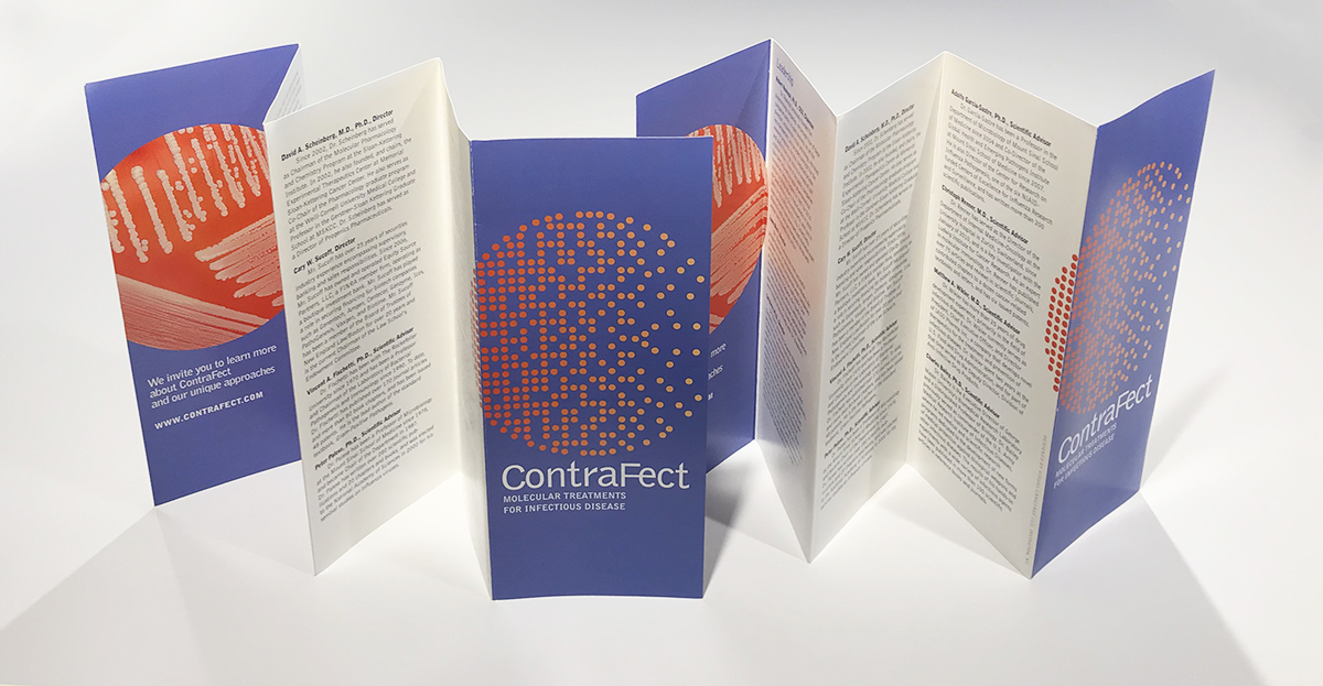
CONTRAFECT CORPORATION Visualizing Powerful New Treatments
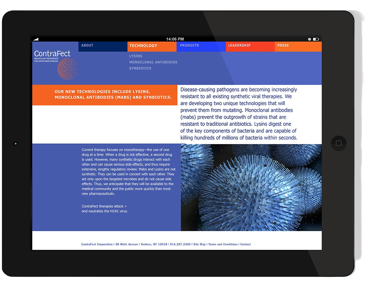
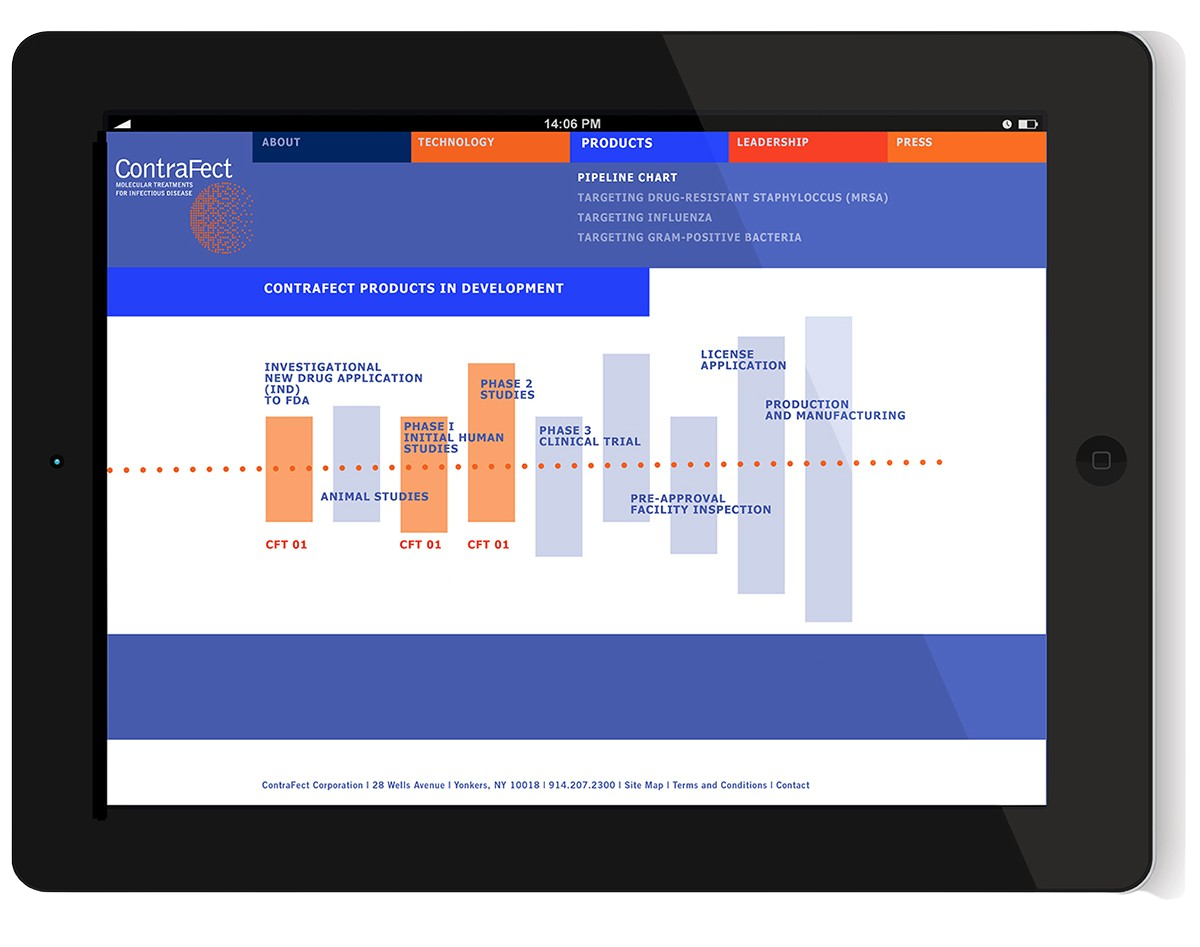
Based in Yonkers, NY, ContraFect is developing new approaches to destroying drug-resistant pathogens that cause hospital infections and disease epidemics.
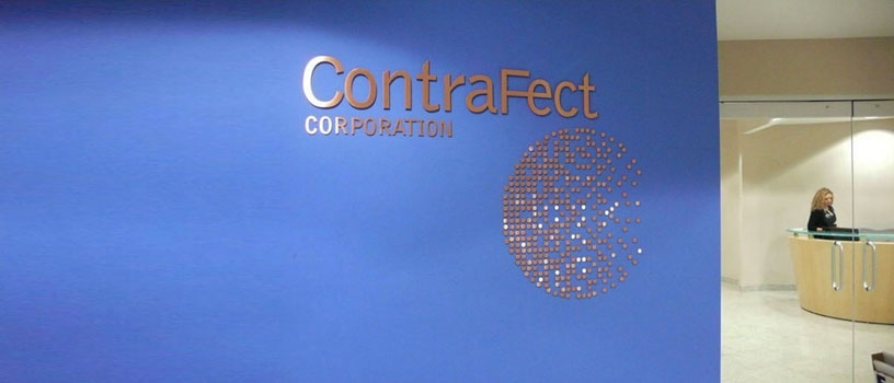
The corporate symbol we developed has layered meanings: a petri dish with disappearing pathogens, a globe, and an abstract ‘C.’
The original website design opened with an animation: the pathogens are wiped out while the text explains the company’s mission.On the office entrance wall, painted ‘ContraFect Blue,” the effect is made dimensional with a 3-D logo in brushed copper.Brochure design: a simple, effective accordion that folds flat and opens to stand up on a deskThe DISRUPT Study for ContraFect’s novel lysin Exebacase is currently being tested in 80 U.S. hospitals as a treatment for patients with Staph aureus bacteremia, including MRSA strains and endocarditis. We developed logo art versions for use on materials from slides to report covers to dark fabric.