• Skip to main content
Visual Language LLC

Visual Language LLC

Writing and Design by Ellen M Shapiro

  • Books
    • The Secret Buttons written and designed by Ellen M. Shapiro
    • Clients and Designers
    • The Graphic Designer’s Guide​ to Clients
    • Alphagram Learning Materials
    • Let’s Read Hebrew!
    • Hand Drum Rhythms
    • Food Trips Cookbook
    • Landscapes & Gardens
    • China Books
  • Magazine
    Writing
  • Essays
  • Client
    Portfolio
  • Media
    &Events
  • Expert
    Witness
  • Contact

Down to Earth Markets

A Brand Built for Taste and Long Shelf Life

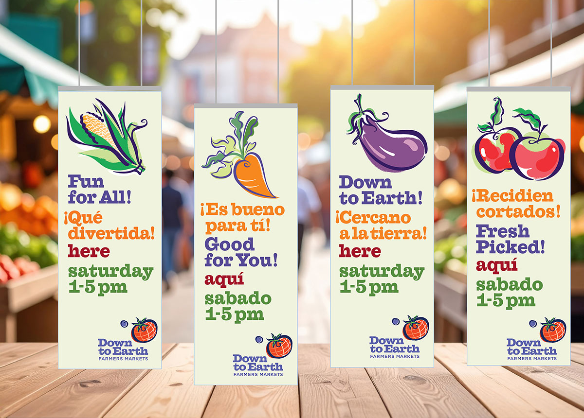
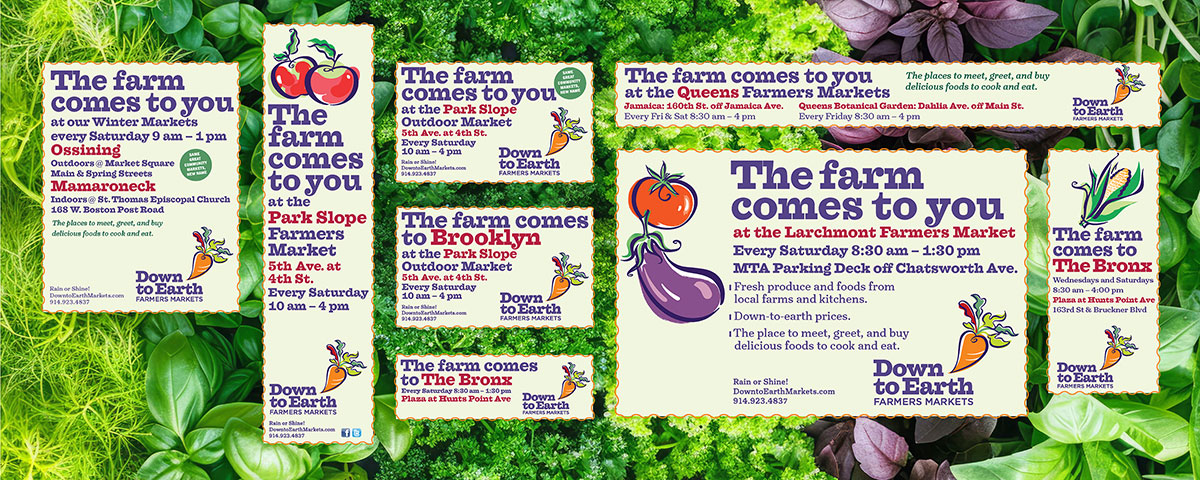
Their name was Community Markets and they came to us for a new name as well as a new look. And we did a lot more: from surveying New York metro-area chefs, home cooks, and others who might (or might not) be interested in shopping at farmers markers to writing ad headlines and copy and developing shoestring-budget marketing ideas and promotions.

The name Community Markets was seen as too generic. The logo was a dated-looking carrot with one red leaf, called the Carabeeta. Name development was the first phase of our engagement — name development with logos. After all, the best name won’t take a company far without a memorable symbol. And a memorable symbol (unless you’re Nike or Starbucks) doesn’t work without a name. I loved my little barn with a chicken on top and ‘markets’ as the silo. The founders did not. Then we came up with a winner: Down to Earth with a tomato globe and blueberry moon.
Weeks later, we were ready to go with banners, newspaper ads for 20 markets, new business cards. There apparently was an uprising among the constituency; the farmers who supplied the markets and the local market managers did not want to lose their Carabeeta. Upsetness, then a quick change to meet deadlines for the season opening and ad placements: Steve Salerno, who’d made the illustrations for the banners, and I turned the carrot into a refreshed Carabeeta.
We put together small-space ads for newspapers in the five boroughs and Westchester and Rockland Counties. ‘Formerly Community Markets’ was a needed tagline under the logos.

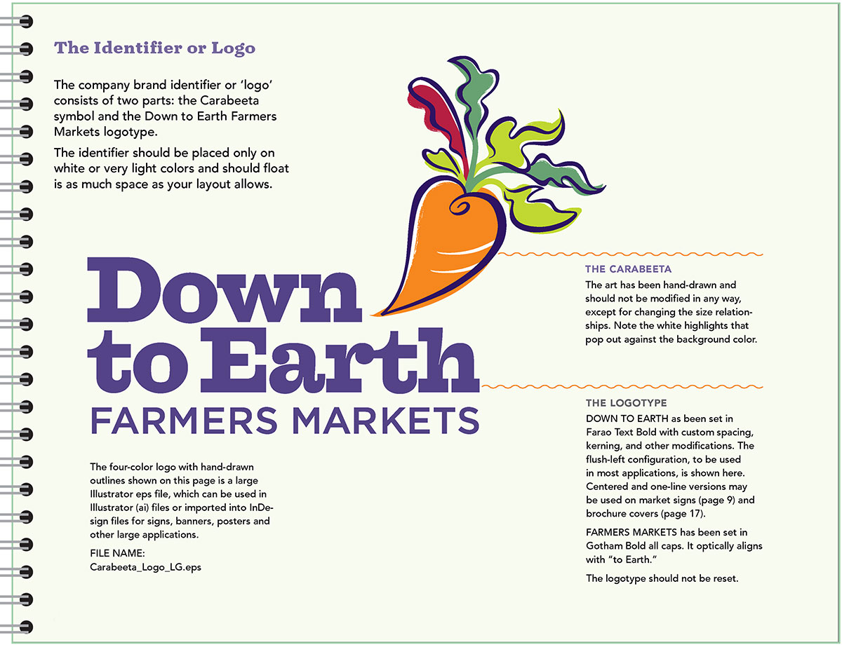
The brand guide provides all needed info and was emailed to market managers along with logo files in full color, one color (Market Eggplant Purple), and black and white.

We developed ads to re-introduce newly re-branded Down to Earth Markets and communicate with local citizens and government officials (who give zoning permits to farmers markets) and why it’s important to patronize them. Down to Earth’s restated mission: “to ensure a future for small-scale agriculture and food production in the New York area by creating vibrant marketplaces where community thrives and shoppers connect directly to the local food system.”
I found Community Markets’ photography, whether in print materials or the website, lacking in taste appeal. Get up close and make it look delicious! Examples are from a mix of my own photography and stock.
The brand book provides guidelines on how to create attractive vendor profiles (shoppers want to know) and produce such necessities as kit folders, rack brochures, and letterhead and business cards — using stock photography and the new library of colors, typography, patterns and recommended layouts.
How to advertise in a metropolitan area of 20 million people with a bushel-basket budget? Besides selling great foodstuffs and being a weekly social event, often with live music, why not print and sell tote bags, caps, tee-shirts and aprons, and let your customers advertise for you? And distribute recipes by your vendors on swappable 3 x 5 cards.

Down to Earth Markets are making a difference! Read the 2024 impact report here.

←previous project
next project→