• Skip to main content
Visual Language LLC

Visual Language LLC

Writing and Design by Ellen M Shapiro

  • Books
    • The Secret Buttons written and designed by Ellen M. Shapiro
    • Clients and Designers
    • The Graphic Designer’s Guide​ to Clients
    • Alphagram Learning Materials
    • Let’s Read Hebrew!
    • Hand Drum Rhythms
    • Food Trips Cookbook
    • Landscapes & Gardens
    • China Books
  • Magazine
    Writing
  • Essays
  • Client
    Portfolio
  • Reviews
    & Media
  • Expert
    Witness
  • Contact

International Typeface Corporation

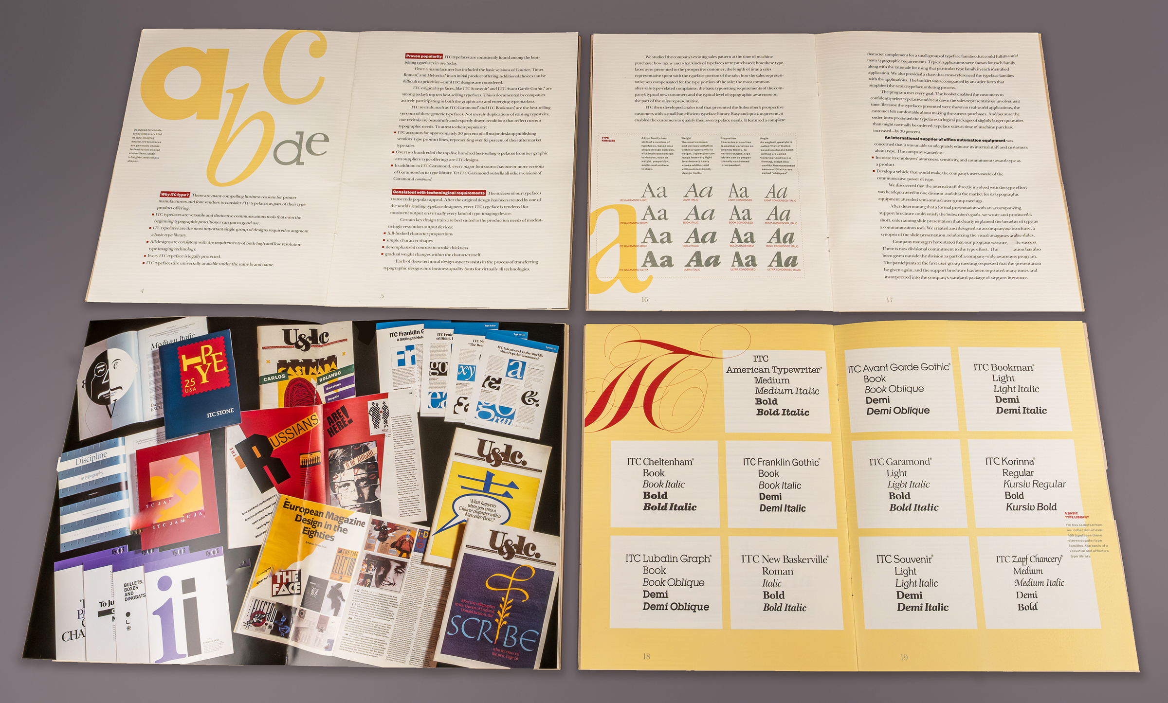
U&lc (Upper and Lower Case, the International Journal of Typo-graphics) had a singular purpose: to showcase ITC typefaces so that the readership of art directors and graphic designers would specify and use them. I began my New York design career Lubalin, Smith, Carnase Inc, where Herb Lubalin made it clear that he was tired of working for (most) clients and wanted to develop and profit from his own products, the typefaces he designed with Tom Carnase, Tony DiSpigna, and others for International Typeface Corporation, of which he was a partner. This black-and-white tabloid was the medium he designed — soon to become an international success. One of my assignments was assisting Herb on the first issues.

Those were the days of mechanical boards, X-acto knives, and rubber cement. Herb gave me his famous scribbles to indicate how each page was to be laid out. All the display type was to be set in the basement typositor, then painstakingly cut apart and re-spaced. Two photostat machines were available to copy it and make glossy repro art sized to fit the area Herb had indicated by a squiggly box. All lines and boxes were to be drawn with crow-quill pen. All body type was specified (by me) on pages typewritten by Herb’s secretary (example: “Set in 14/16 Avant Garde Gothic Light, set tight not touching, flush left rag-right x 18 picas wide”) to exactly fit the layout. Back in the day, each spread was the product of several long days of work, including revisions if Herb felt elements should be adjusted or moved. Today, these spreads could be made in Adobe InDesign in a few hours. I bet that if Herb were alive today he could tell the difference and would appreciate the look and feel of the mechanical-board paste-up version better.
In 1988, seven years after Herb — my mentor and father figure — died, I won a competition to art direct several issues of U&lc. This issue, featuring tongue-in-cheek “kanji” designed by Katsuichi Ito (look him up!) remains my favorite. The earlier issues were all black-and-white because Herb loved the idea of black-and-white on newsprint. But as the publication became universally popular, color was introduced on the pages that showcased art in which color was so important. By that time, ITC had introduced many more typefaces. True to U&lc’s original intent — popularize and sell ITC typefaces — this 8-page story is set in ITC Novarese.
Another favorite cover and spread, featuring the elegant work of the Donald Jackson, the scribe to the Queen of England. (I must check to see if King Charles and Queen Camilla have a scribe.) Does it seem as if every element is exactly as it should be? I felt that way designing these pages. The words and images themselves seemed to communicate whether they should be large or small, bleed or not, and in what relationship to each other. This story was set in ITC Galliard. The editors sent me a list of the typefaces they wanted each issue to feature.
More spreads that I loved working on. How rare to get the opportunity to present the great design, photography, and illustrations of others in their best light. I hope Herb would have been proud of me.
“Everybody” submitted their design work, illustrations, and photography to be showcased in U&lc. I was no exception. During a 1985 trip to San Sebastian, Spain — Basque territory — I saw that local businesses identified themselves with distinctive signs that expressed their individualism and separatism from mainstream Spanish culture and language with hand lettering that resembled ITC Quorum Bold. I submitted my manuscript and black-and-white photographic prints to the editor, Aaron Burns. The result: my first story in a design publication. The issue celebrates the 200th anniversary of the Statue of Liberty, and the story, laid out by Bob Farber and Ilene Strizver in ITC Quorum, celebrates “a spontaneous, grassroots identity program in which the client and the designer are the same, in total agreement on the program’s social and political value.”
When my tenure at U&lc came to an end — over the years, many designers had the honor of filling the role — I was offered the opportunity to design and edit a brochure to introduce software companies and computer manufacturers to licensing a suite of eleven basic ITC typefaces (out of 400 then available). No more newsprint. I was able to choose elegant textured cover and text stocks and specify printing techniques including engraving and tinted varnish.
This project gave me the opportunity to showcase much of what I’d learned about type and to art direct the center spread — on glossy stock — a still life of specimen booklets and other ITC marketing materials available to the company’s business partners. The text of the brochure was set in ITC New Basketville and the heads and captions were set in ITC Franklin Gothic Heavy, a popular font pairing to this day.
Two of the “graphics” I designed to introduce hardware and software manufacturers to the language of typography.

←previous project
next project→