• Skip to main content
Visual Language LLC

Visual Language LLC

Writing and Design by Ellen M Shapiro

  • Books
    • The Secret Buttons written and designed by Ellen M. Shapiro
    • Clients and Designers
    • The Graphic Designer’s Guide​ to Clients
    • Alphagram Learning Materials
    • Let’s Read Hebrew!
    • Hand Drum Rhythms
    • Food Trips Cookbook
    • Landscapes & Gardens
    • China Books
  • Magazine
    Writing
  • Essays
  • Client
    Portfolio
  • Media
    &Events
  • Expert
    Witness
  • Contact

Sunnyside Federal Savings

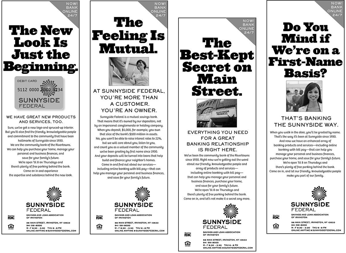
The New Look Was Just the Beginning

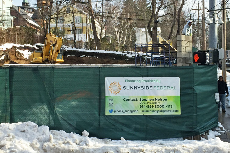
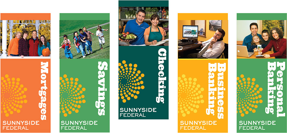
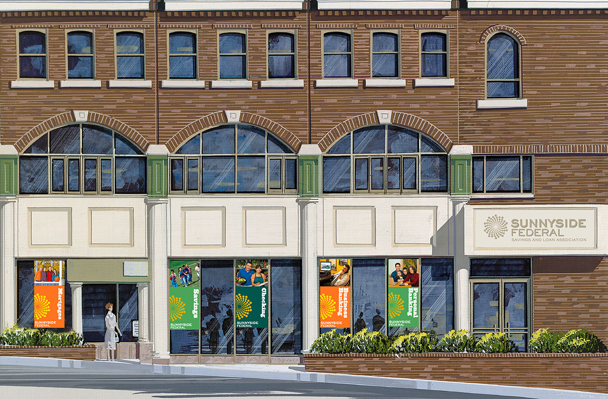
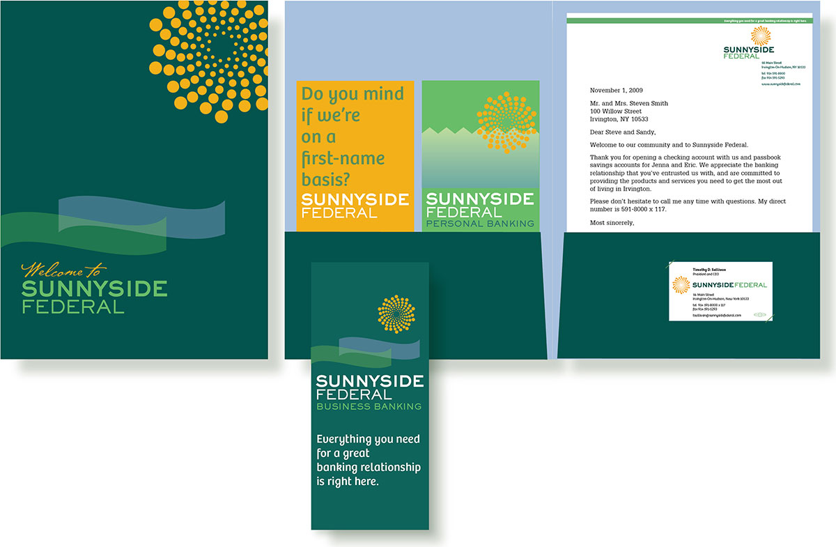
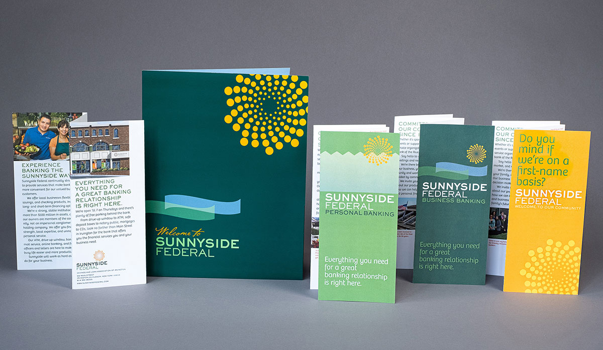
We brightened up a neighborhood institution on Irvington’s Main Street with this sunny “fractal,” a geometric form made of many parts, like the community of customers who bank at Sunnyside.

The bank president’s two must-haves: (1) Come up with ways to bring us more customers. (2) Redesign our dated logo, but it has to be a sun and the colors must be green and yellow-gold. To develop the campaign, I surveyed a range of existing personal and business customers and potential new customers, including those who preferred to bank at the Chase branch, across the street. The process continued with a report including recommendations for a new slogan, ad campaign, and banners in the bank windows. I was concerned that a green and yellow-gold sun might look like it was for a motel, but my explorations with designer Emily Shields, were most fruitful when we got deeply into the fractal direction. Most important recommendation: let’s feature well-known community members in the ads, banners, website, and all print materials.
Each service or product the bank offers was matched by a photo of local families, kids, business people, and shopkeepers who bank at Sunnyside.
In the windows: creating a colorful buzz on Main Street.
Friendly greeting: This large sign welcomes customers to the bank. The slogan tells it exactly like it is.
The ads: a half-page campaign in the local papers re-introduced citizens to the benefits of doing business with their local bank.
Welcome kit: mockup. Our mockups demonstrate exactly how finished pieces will appear.
Welcome kit: reality. The rack brochures demonstrate how Sunnyside meets the needs of business and personal banking customers. One brochure was written to specifically greet prospective homeowners moving to the Rivertowns, typically from Brooklyn or Manhattan when they’re seeking a friendly, safe, family-oriented community with good public schools.

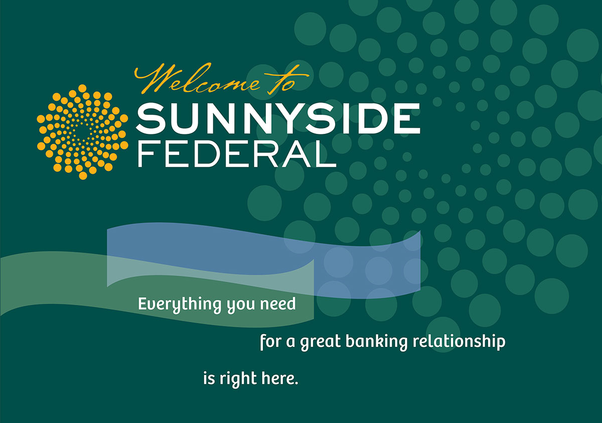
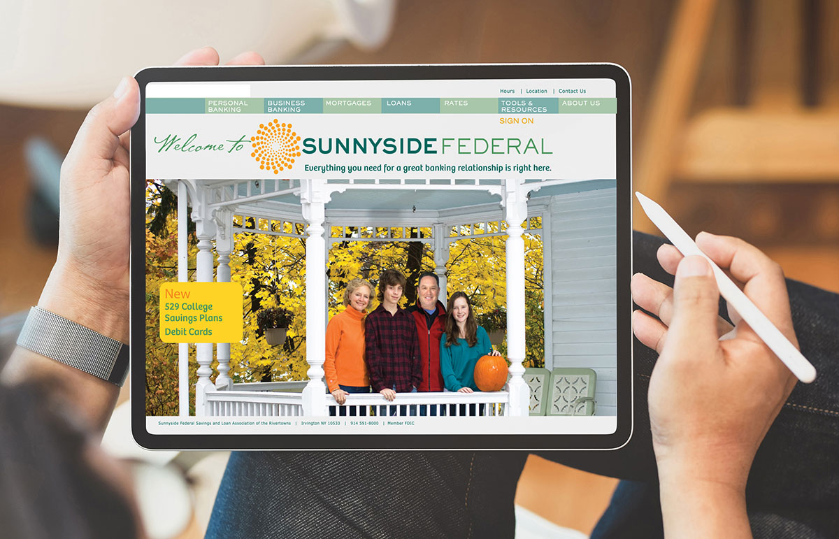
The website continued the theme of featuring locals’and their reasons for banking at Sunnyside.
Out in the world: The now-familiar Sunnyside brand identifies financing for community projects, here in the neighboring village of Dobbs Ferry, NY.
←previous project
next project→